Redesigned Core Pages
Homepage, service pages, and outreach content redesigned for clarity and trust-building.
A 9-month UX research project uncovering how an environmental engeneering BLLC nonprofit could better communicate its mission, services, and impact to the people it serves.
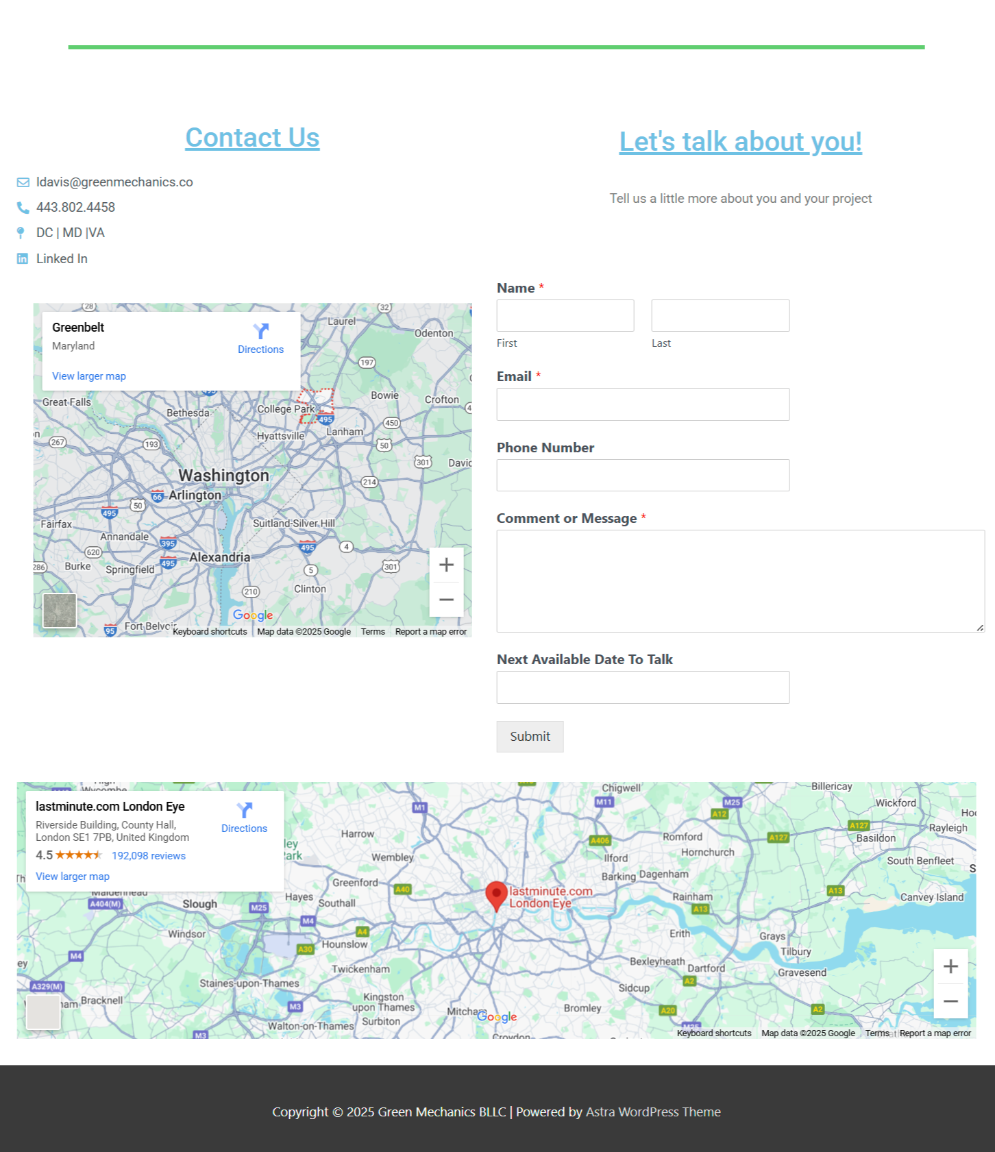
Help visitors decide if Green Mechanics is the right fit for them in "five clicks or less".
Create a user-friendly website that showcases their environmental services and allows potential clients to quickly understand Green Mechanics' offerings.
9 Months
End-to-end UX Redesign
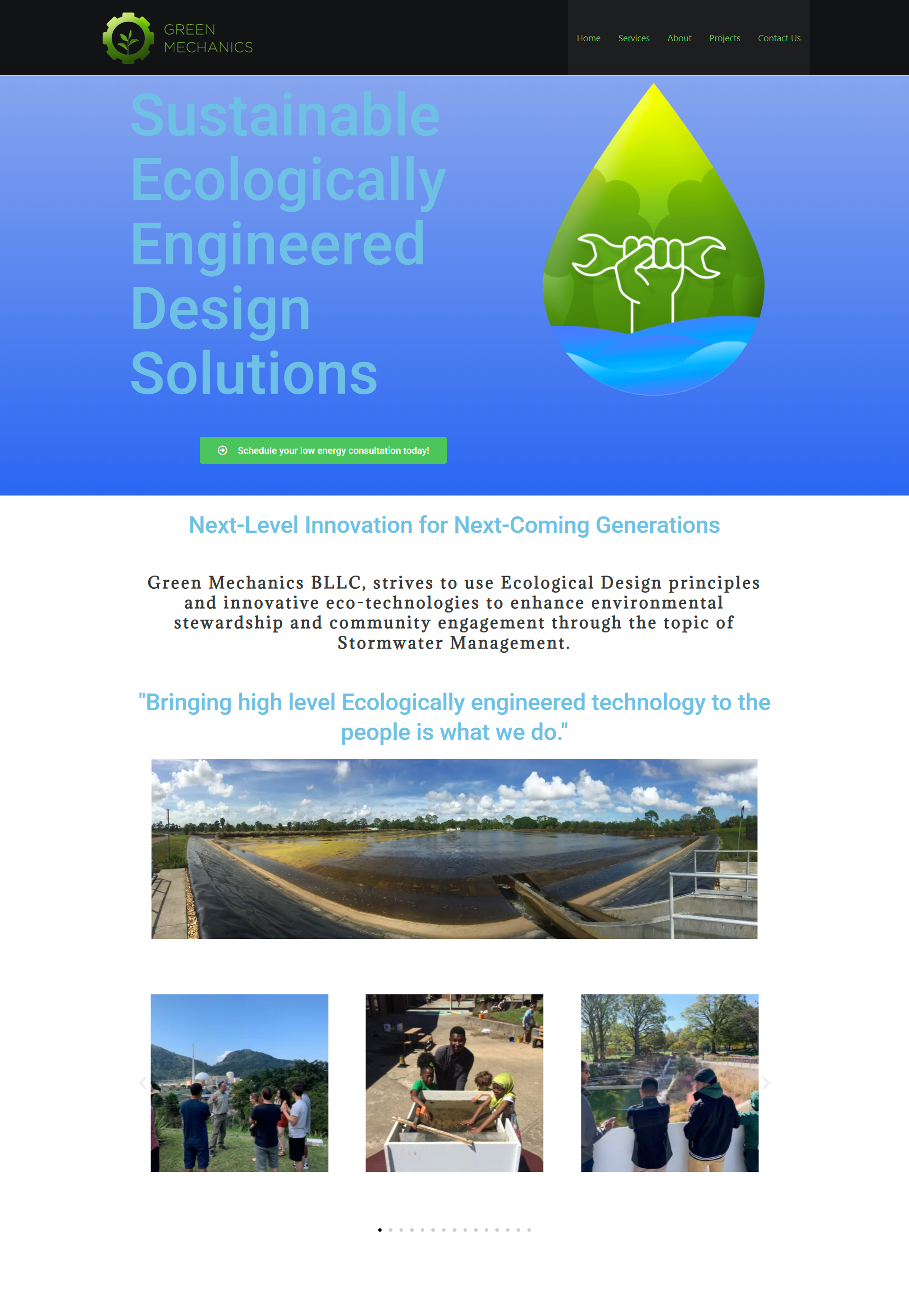
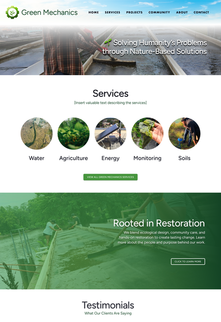
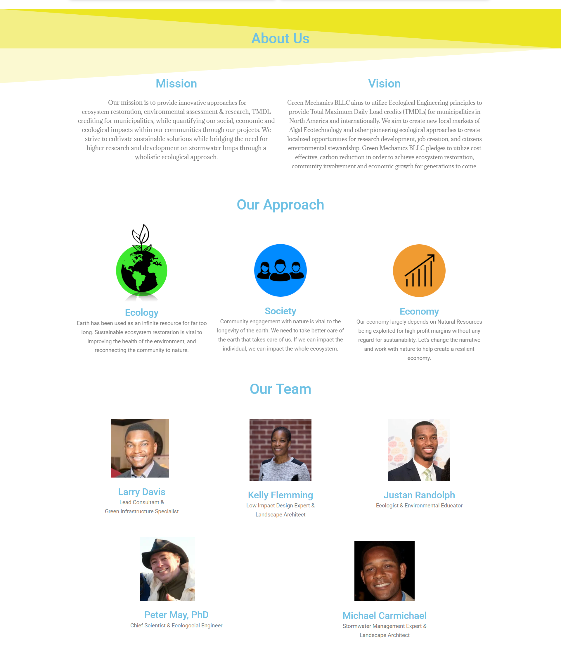

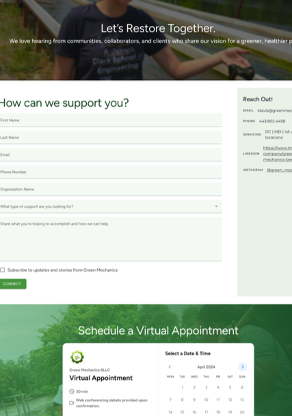
Homepage, service pages, and outreach content redesigned for clarity and trust-building.
Delivered full high-fidelity Figma prototype to support client implementation.
Created a modular design system enabling future site growth and consistency.
Before each sprint, we outlined clear plans to guide our work in our project sprint plan. We held weekly check-in with the client to stay aligned, and closed each sprint with a client retrospect to reflect, gather feedback and adapt our approach moving forward.
We aligned with our client on mission and scope through a kickoff meeting, content audit, and competitive peer analysis. We identified design gaps and set a clear foundation for the project.
User and stakeholder interviews uncovered pain points around clarity, navigation, and trust-building, which shaped personas and a new site map.
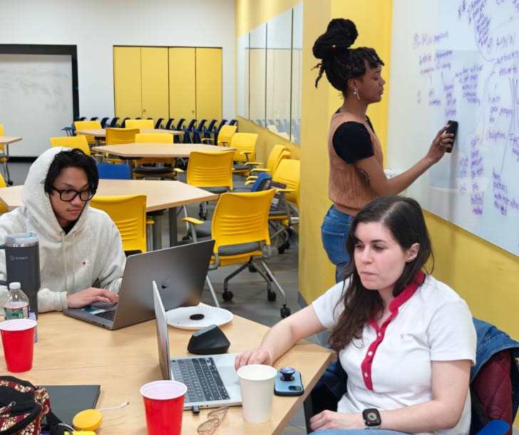
Using Crazy 8s and sketching exercises, we translated research insights into low-fidelity wireframes to explore layout options.
Through a branding workshop, we established Green Mechanics' design system and brand guidelines.
We refined designs through iterative prototyping, tested usability with stakeholders, and finalized client-ready deliverables.
We began our research phase with a clear goal: understand what users needed from the Green Mechanics website and where the current experience was falling short. Our research was driven by the following question:
“What are the expectations of users who visit the Green Mechanics website and how well does the website showcase available services and past projects in a way that is visually appealing and easy to navigate?”
We identified three distinct user groups: past clients, internal staff, and collaborators, and recruited roughly equal representation across all three to ensure findings reflected the full range of stakeholder perspectives.
We conducted semi-structured interviews with 14 participants. Each session followed a shared set of core questions, with follow-up questions adapted in real time based on participant responses and behaviors, allowing us to probe unexpected directions without sacrificing consistency across sessions.
Usability testing was embedded directly into each interview. Participants navigated the live site while sharing their expectations, mental models, and trust signals, giving us behavioral observation and self-reported data simultaneously.
With 14 interviews across three audience segments, synthesis required a structured approach. We combined affinity mapping to cluster emerging themes, qualitative coding of session notes, and quantitative tallying of recurring pain points producing both the pain point bar chart and the thematic groupings that drove our How Might We framing and design priorities.
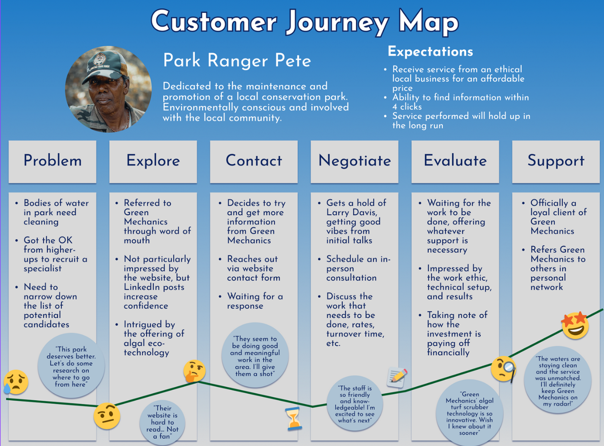
We developed a Customer Journey Map to visualize the experience of key user groups, identifying frustrations, expectations, and trust-building opportunities across stages.
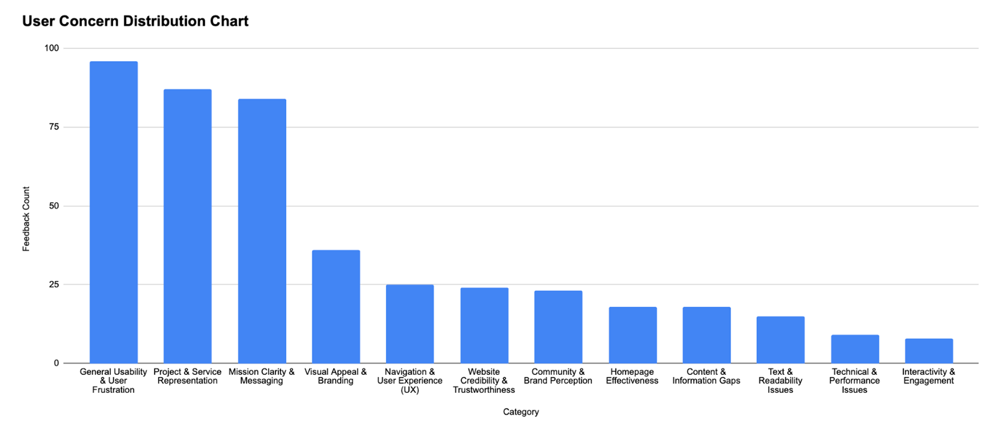
Bar chart summarizing recurring user pain points across navigation, messaging, and trust-building elements. This quantitative analysis of interview data highlighted common patterns and directly informed our design priorities and content strategy.
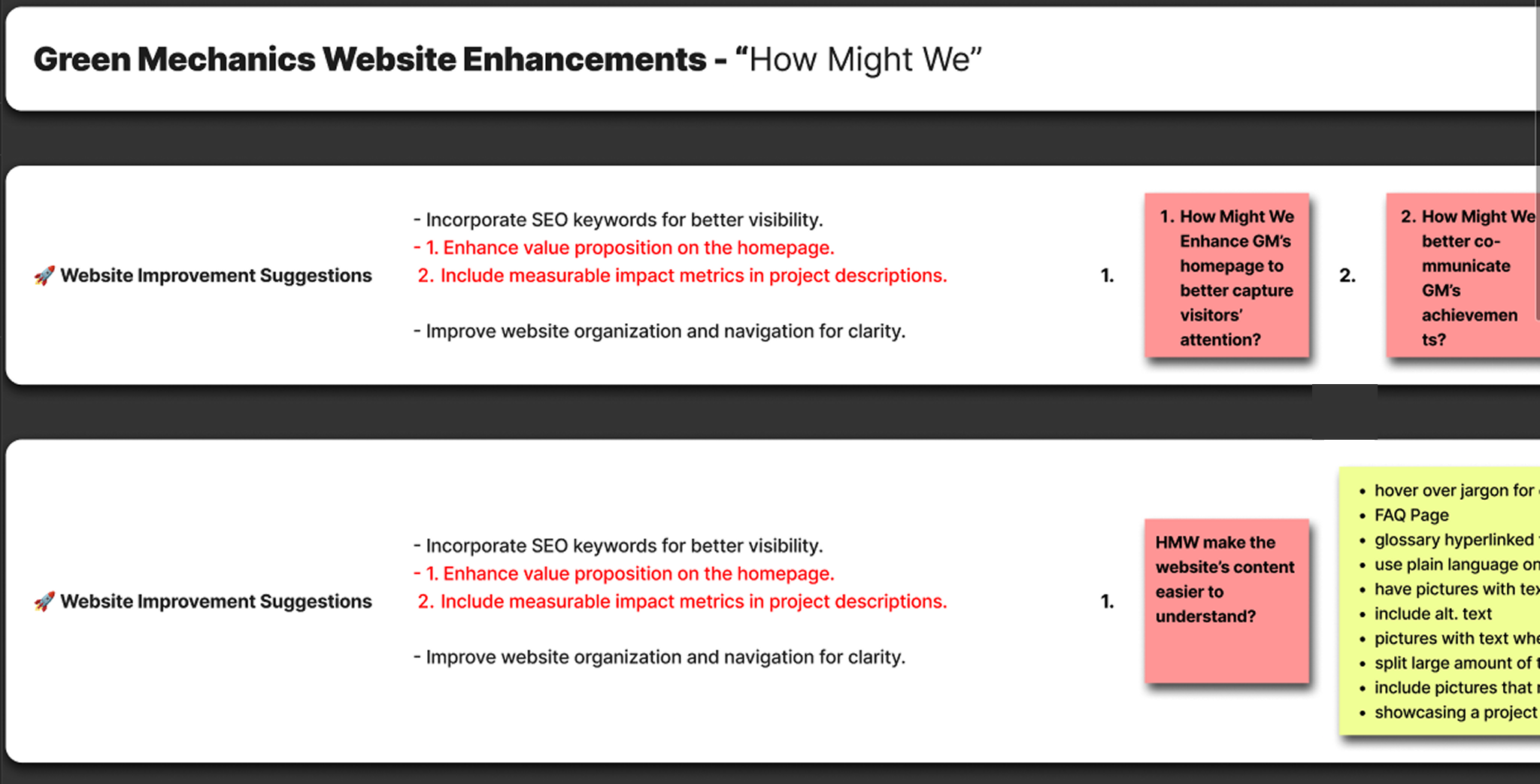
Building on our research, we identified key focus areas using "How Might We" framing to structure actionable design solutions.
Our research helped us gain a clearer understanding of the marketing and content design improvements that would align with both user needs and client goals.
This project reinforced the power of user-centered design to simplify complex information, build trust, and align design solutions with real organizational goals.
Working across 14 interviews and three distinct user groups taught me that synthesis is its own research skill, separate from data collection. Grouping insights at a high level before diving into specifics helped surface patterns that individual sessions obscured. Combining affinity mapping, qualitative coding, and quantitative tallying gave the team a shared language for prioritizing findings and communicating them clearly to the client without losing nuance in the process.
Clearly defining team communication protocols reduced misunderstandings and created a more efficient and collaborative workflow.
Weekly client check-ins significantly improved transparency and kept expectations aligned throughout the project. Clearly defining team communication protocols early reduced misunderstandings and created a more efficient collaborative workflow, this applies equally to research stakeholder management as it does to project management.
Scope creep is a real research risk. Being realistic about what was achievable within our timeline meant we could concentrate effort on the insights and design directions that mattered most, rather than spreading too thin. Knowing when to constrain a research scope is as important as knowing what to investigate.
(Roles were rotated after each sprint)