Initial Brainstorming
Notes helped clarify the themes, tone, and major emotional beats. Early ideas were centered on fear, curiosity, and the mundane.
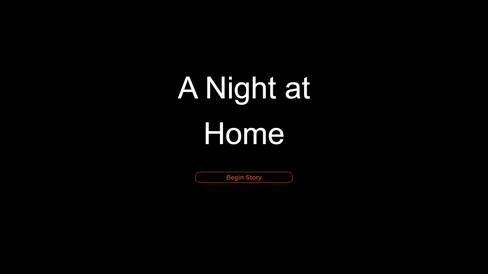
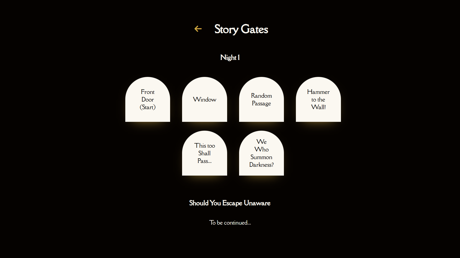
A branching narrative horror game where your choices shape the story and determine your fate.
Developed over 2 months (November–December 2024), A Night at Home is a branching narrative horror game where players decisions shape the story, blending interactive fiction with subtle atmospheric horror.
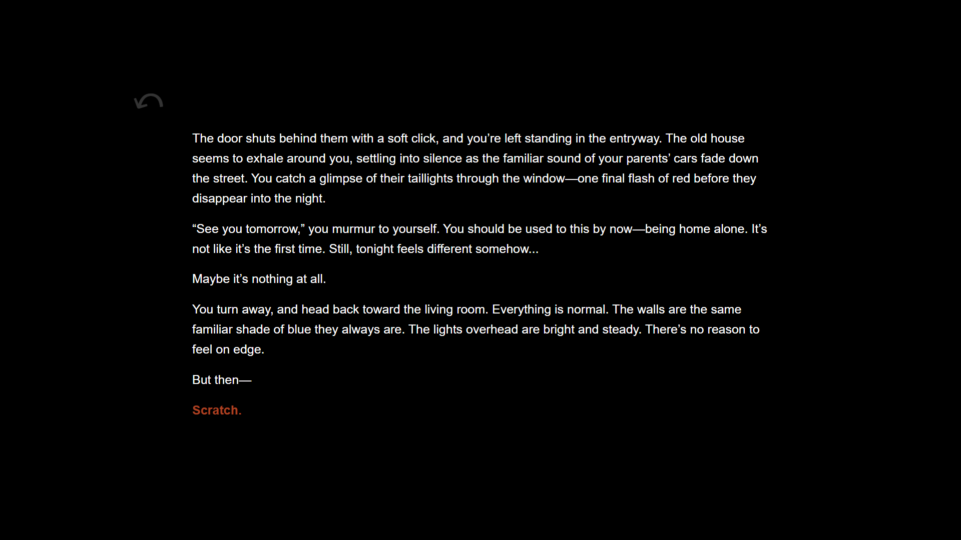
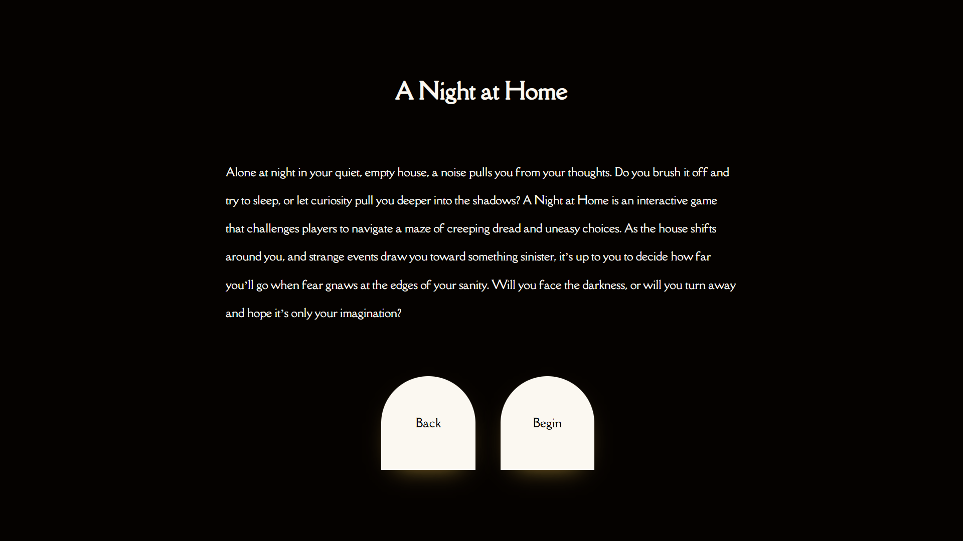
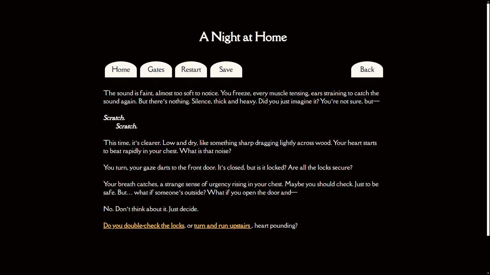
Alone at night in your quiet, empty house, a noise pulls you from your thoughts. Do you brush it off and try to sleep, or let curiosity pull you deeper into the shadows?
Navigate a maze of creeping dread and uneasy choices in this interactive horror experience.
The development of A Night at Home moved through multiple phases — from story planning to interactive prototyping and finally a custom-coded interface.
Mapped narrative structure and key branching decisions using diagrams and flowcharts. Early visual planning helped define tone and pace.
Built a playable Twine prototype to test narrative logic and player choice flow. Iterated based on usability testing and readability concerns.
Used Twison to convert the Twine story into structured JSON data. This enabled full control over passage rendering and logic.
Rebuilt the experience using HTML, CSS, and JavaScript. Implemented a custom navigation system, conditional logic, and a responsive layout.
The game started as a simple Twine game. Over time, it transformed into a polished, custom interactive experience.
Before any technical implementation, the story structure was carefully mapped across several stages — from loose brainstorming to a full interactive diagram in Twine.
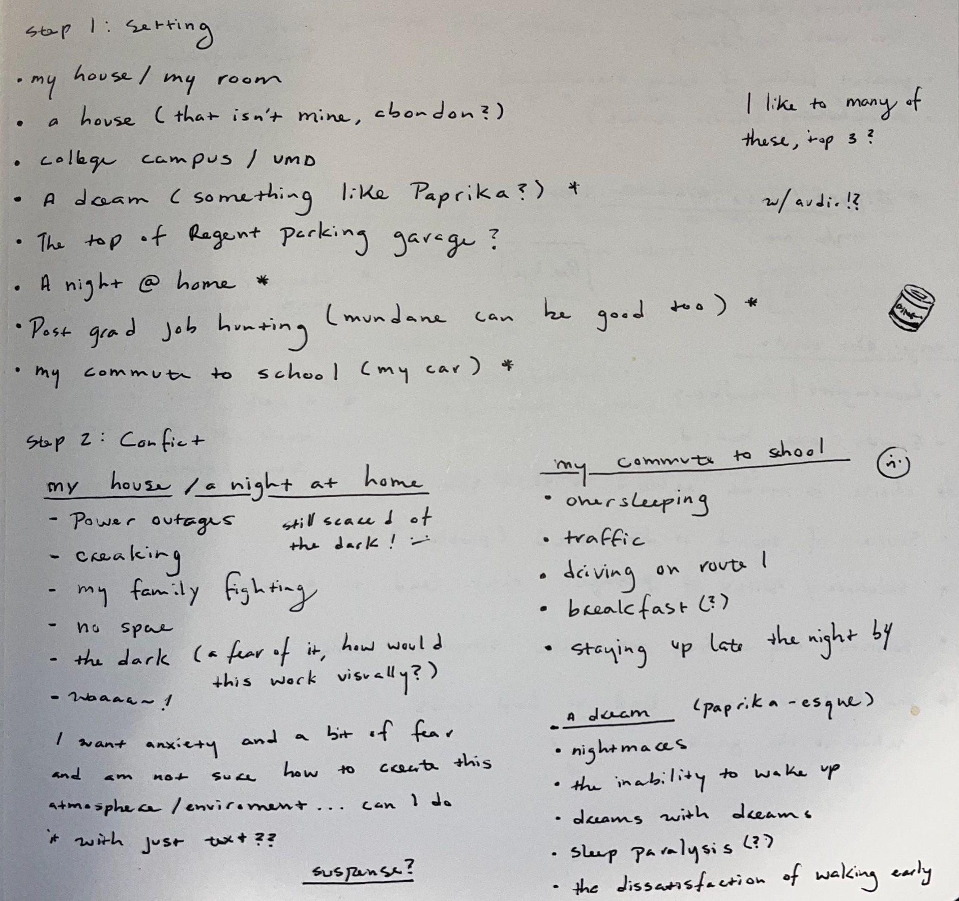
Notes helped clarify the themes, tone, and major emotional beats. Early ideas were centered on fear, curiosity, and the mundane.

This branching diagram laid out key choice points and structural pacing, allowing for early testing of flow and pacing.
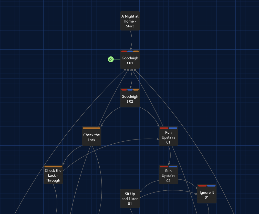
The final version was fully playable in Twine, showcasing 3 major paths and 5 possible endings. It served as the reference for all future implementation.
Each phase of development was guided by structured user testing sessions with 5–8 participants recruited from both my personal network and people unfamiliar with the project. Sessions combined direct observation, think-aloud, and written feedback collection — giving me behavioral data, in-the-moment reasoning, and reflective responses to triangulate across.
Building an interactive horror experience required balancing choice architecture with pacing and visual design.
Managing the length of passages was the key to maintaining flow. Early versions were too dense, so I focused on making each segment digestible and purposeful through iterative testing.
The transition to a custom interface using Twison broke some internal logic, forcing me to create a new navigation system and rethink how story data is handled.
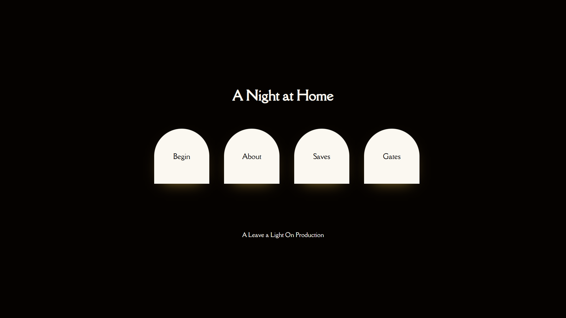
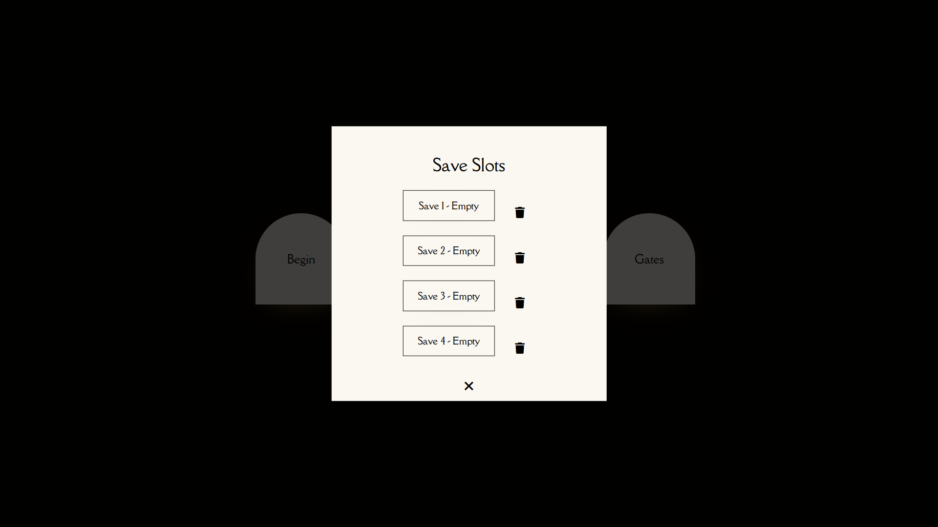
The UI needed to support the tone of the story while staying intuitive. This included integrating save features, responsive layout, and page styles that reflected what's happening on-screen without distracting from the story.
Designing branching narratives taught me how structural decisions: where to place a choice, how much information to withhold all directly shape a player's emotional experience. What started as a writing challenge became a lesson in how information architecture drives user behavior and perception.
Running sessions with both think-aloud observation and written feedback revealed a consistent gap between what players experienced in the moment and what they remembered afterward. Players would narrate confusion or hesitation while playing, then rate the experience in written feedback. That tension taught me to weight behavioral data heavily and treat self-reported feedback as a secondary signal.
The most important shift was learning to sit with raw feedback before acting on it. Early on I'd make changes after a single session. By the second round I was reviewing all notes together first, looking for patterns before drawing conclusions. Resisting the urge to fix the loudest piece of feedback immediately is what turned my user testing into actual research.